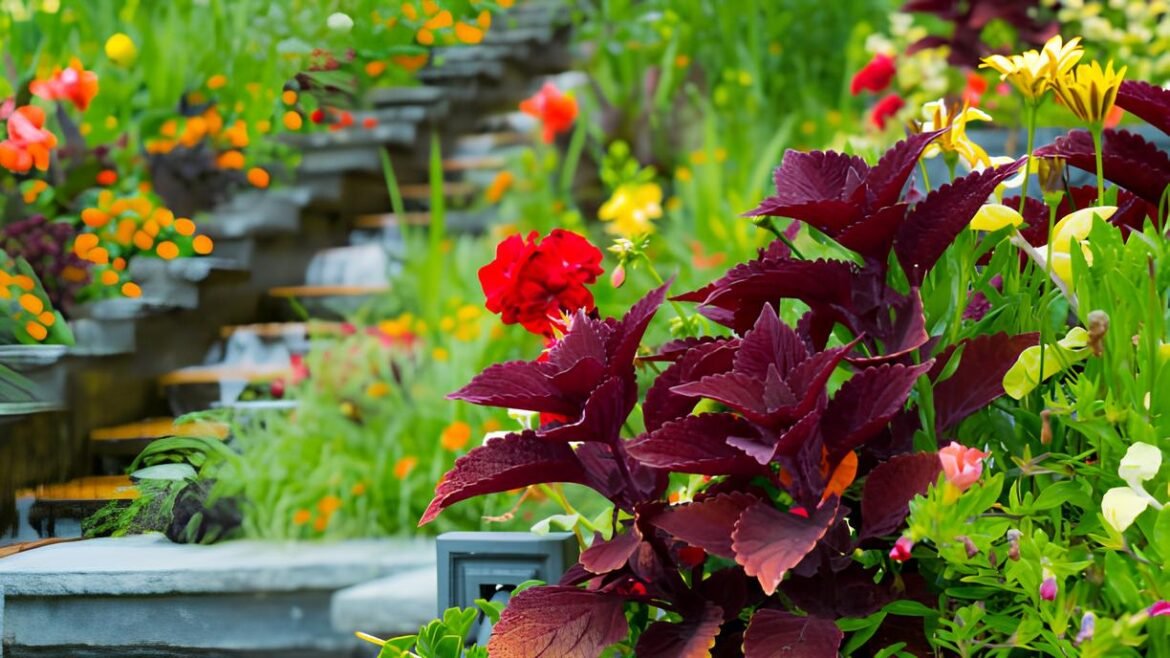
Have you ever wandered through a garden and felt like the colors were guiding your eyes, almost like a gentle dance from one bloom to the next? Color isn’t just decoration in our outdoor spaces—it’s a language that shapes mood, creates balance, and invites us to explore. Harnessing color thoughtfully in your garden can transform it from a random collection of plants into a harmonious flow that delights morning, noon, and dusk alike.
Understanding Color Flow in Gardens
Color flow in landscaping isn’t about random splashes of your favorite hues. It’s a subtle movement, weaving color tones and shades that harmonize while encouraging your gaze to move through the space effortlessly. Just as an artist composes a painting to lead the viewer’s eye, a gardener uses color to craft visual journeys that invite discovery.
Think of your garden as a narrative. Bright reds can spark excitement, cool blues calm, and soft pastels whisper serenity. When positioned thoughtfully, these colors create rhythm and repetition that help visitors navigate the terrain naturally—without feeling lost or overwhelmed.
Choosing a Cohesive Color Palette
Before you plant a single bloom, it’s wise to select a color palette with intention. Are you drawn to warm tones like corals, yellows, and fiery oranges, or do you prefer cool shades such as blues, purples, and soft greens? Or maybe you crave a blend of both for dynamic contrast?
Start with 3 to 5 main colors to maintain coherence. Keep in mind that too many competing colors can create visual chaos, while a limited palette tends to bring a polished, curated look. Using different tints, shades, and saturations of your chosen palette adds variety without sacrificing harmony.
For inspiration, browse outdoor spaces or plant catalogs focusing on “landscaping plants that make your yard instantly look pulled together.” They often reveal palettes that balance familiarity with surprise.
Layering Colors to Create Depth
Depth in a garden comes from stacking colors thoughtfully within your planting layers. Start with evergreen or neutral-toned foliage as a backdrop. Then, plant mid-level perennials and shrubs in your primary color, topping off with accent plants or flowers in brighter or softer shades.
Pay attention to the height and placement of plants to create a natural gradient that guides onlookers from ground level to eye-level and beyond. This layered approach mirrors natural landscapes and adds a tactile dimension, making the garden feel lush and living.
Use foliage with varied textures and subtle color changes to smooth transitions between bold flower hues, enhancing natural flow.
Using Contrast to Guide the Eye
Not all colors need to blend gently—strategic contrast can create powerful visual markers. For example, placing a deep violet flower amidst a bed of soft whites naturally draws attention and creates a focal point.
Complementary colors—those opposite each other on the color wheel, like blue and orange or red and green—energize the space when paired sparingly. Contrasts work best when balanced with neighboring plants in muted or analogous tones, so the garden doesn’t feel jarring.
Walking paths or seating areas benefit especially from these accents. They act like visual magnets, inviting guests to pause or journey further.
Seasonal Color and Year-Round Interest
Gardens aren’t static; they evolve with the seasons, and your color strategy should embrace this natural rhythm. Spring bulbs might bring early shots of yellow and purple, while summer perennials provide vibrant reds and oranges. Fall leaves grill the garden in warm golds, rusts, and crimsons.
Incorporating plants with interesting bark, berries, or foliage creates visual flow even when flowers aren’t at their peak. Evergreens, grasses, and shrubs with colorful stems become players in your palette.
Planning for seasonal color means your garden remains engaging year-round, a living artwork shifting with time rather than fading into silence.
How Color Influences Garden Mood
Color psychology isn’t just for interiors—your outdoor space benefits too. Warm hues like reds, oranges, and yellows tend to energize and stimulate conversation, perfect for areas where people gather.
In contrast, blues, purples, and greens promote tranquility and reflection, making them ideal for meditation corners or quiet patios. Soft pastels impart lightness and whimsy, encouraging playful and joyful feelings.
Matching your garden’s color tones with your intended mood makes your outdoor space an extension of your lifestyle, not just a pretty backdrop.
Be cautious when mixing too many high-intensity colors without balance — too much stimulation can overwhelm the senses and disrupt the garden’s calm.
Frequently Asked Questions
Can I use bright colors in a small garden?
Yes! Use bright colors as accents or along edges to create focal points without overwhelming the space.
How do I prevent colors from clashing?
Stick to a limited palette and use neutral or foliage colors to soften transitions. Analogous colors (next to each other on the color wheel) often blend well.
What are some low-maintenance plants with great colors?
Plants like Black-eyed Susans, lavender, daylilies, and hostas offer rich colors with minimal upkeep.
Turning Color Into Your Garden’s Story
Creating visual flow in your garden through color is both an art and a joyful experiment. It’s about seeing beyond isolated blooms and imagining how they interact—the gentle conversations colors hold conversation across distance and time.
With thoughtful palette choices, layered positioning, and seasonal planning, your garden becomes a living tapestry rich in emotion and movement. It’s the difference between a “pretty” space and a garden that feels alive every time you step outside.
Ready to dive deeper into crafting harmonious outdoor spaces? Explore our revealing guide on landscaping plants that make your yard instantly look pulled together for ideas that mesh planting with design brilliance.


1 comment
Hello, i think that i saw you visited my weblog so i came to “return the favor”.I am trying to find things to improve my web site!I suppose its ok to use some of your ideas!